How to Choose a Color Palette for Home Decor

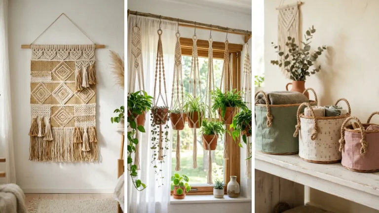
Have you ever finished a beautiful handmade piece — a macramé wall hanging, a painted vase, or a woven basket — only to bring it home and realize it clashes horribly with everything else in the room? You’re not alone. Knowing how to choose a color palette for your handmade home decor is one of the most overlooked skills in the crafting world, yet it makes the biggest difference between a room that feels curated and one that feels chaotic.
The good news? You don’t need a design degree to get it right. In this guide, you’ll learn practical, beginner-friendly strategies for picking colors that work together, reflect your personality, and elevate every handmade piece you create.
Whether you’re starting from scratch or refreshing a room, these tips will help you make confident color decisions every single time.
Why Color Matters More Than You Think in Handmade Decor
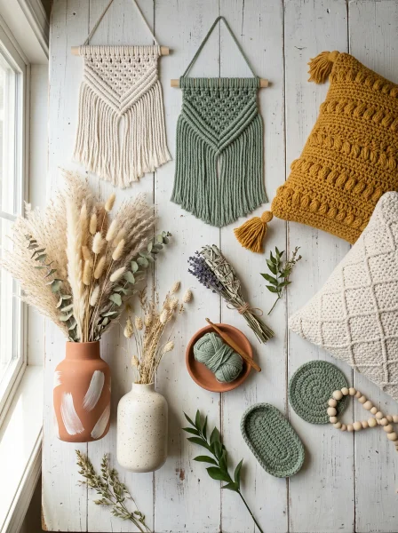
Color is the first thing people notice when they walk into a room. Before they see the texture of your hand-knitted throw or the detail on your painted picture frame, they feel the overall mood — and that mood is almost entirely created by color. Research in environmental psychology consistently shows that color influences emotion, energy levels, and even how spacious a room feels.
When it comes to handmade decor, the stakes are even higher. Unlike store-bought items that are designed to be neutral and broadly appealing, your handmade pieces carry intention. Choosing the wrong colors can make even the most skillfully crafted item look out of place.
Choosing the right ones? It makes your entire space feel like it was designed by a pro. This is especially important if you’re creating DIY handmade gifts for someone else’s home — understanding their color palette means your gift will actually be used and displayed, not tucked away in a drawer.
Start With the 60-30-10 Rule for a Balanced Color Palette

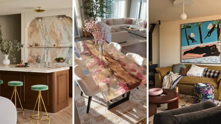
The 60-30-10 rule is a classic interior design principle that works beautifully for handmade home decor. Here’s how it breaks down: 60% of your room’s color comes from a dominant hue (usually walls or large furniture), 30% from a secondary color (rugs, curtains, upholstery), and 10% from an accent color (decorative objects, pillows, your handmade pieces). If your walls are soft white and your sofa is warm gray, your handmade decor becomes the perfect opportunity to introduce that punchy 10% accent.
Think terracotta, mustard yellow, sage green, or deep navy — colors that pop without overwhelming. The beauty of this rule is that it gives you a framework without being restrictive. You can swap secondary and accent colors across seasons or projects, keeping your space feeling fresh while maintaining visual harmony.
How to Apply This Rule to Individual Craft Projects

Let’s say you’re making a set of hand-painted ceramic pots. Instead of painting each pot a different random color, pick one dominant color for the largest pot, use a complementary shade for the medium pot, and introduce your accent color on the smallest. This creates a cohesive set that looks intentional.
The same logic applies to textile crafts, wreaths, wall art, and even home craft projects quick — small projects benefit just as much from a deliberate color strategy as large ones do.
How to Choose a Color Palette for Your Handmade Home Decor Based on Mood

Before you dive into color swatches, ask yourself: How do I want this room to feel? The answer should guide every color decision you make. Different colors trigger different emotional responses, and being intentional about this is what separates thoughtful design from random decorating. Here’s a quick mood-to-color guide:
- Calm and relaxing: Soft blues, muted greens, lavender, warm whites
- Energizing and creative: Warm yellows, coral, bright terracotta, citrus tones
- Cozy and grounded: Earthy browns, rust, olive green, deep burgundy
- Elegant and sophisticated: Navy, charcoal, dusty rose, gold accents
- Airy and minimal: White, soft beige, pale gray, natural linen tones
For bedrooms, lean toward calm and grounding palettes. For studios or craft rooms, energizing colors can boost creativity. For living rooms, cozy and warm tones tend to be universally loved.
Use Color Theory to Build Harmonious Combinations

You don’t need to memorize every color theory rule, but understanding a few key relationships will save you from a lot of mismatched mistakes. The three most useful combinations for home decor are complementary, analogous, and triadic color schemes. Complementary colors sit opposite each other on the color wheel — like blue and orange, or yellow and purple.
These create high contrast and visual excitement. Use them when you want a bold, statement-making piece. Analogous colors sit next to each other on the wheel — like yellow, yellow-green, and green.
These feel natural and soothing, perfect for a cohesive, layered look. This is one of the easiest schemes to work with for beginners. Triadic colors are evenly spaced around the wheel — like red, blue, and yellow.
This scheme is playful and vibrant but requires careful balance. Use one color as dominant and the others as accents.
Pulling Inspiration From What You Already Own
One of the smartest ways to build a color palette is to look at what you already love in your home. Do you have a rug with a beautiful pattern? Pull three colors from it.
A beloved piece of artwork? Sample its hues. Even a favorite throw pillow can become the foundation of your entire color story.
This method works especially well when you’re exploring fun crafts to make at home — you can tailor every project to match your existing decor without any guesswork.
Budget-Friendly Tips for Testing Your Color Palette
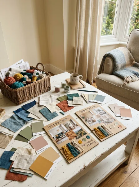
Before you commit to a full project, test your palette in low-stakes ways. Paint small swatches on cardboard and hold them up in different lighting — morning light and evening lamplight can make the same color look completely different. This small step prevents costly rework later.
If you’re on a tight budget, dollar store crafts ideas are a fantastic way to experiment. Buy inexpensive items in your chosen colors to see how they look together in your actual space before investing time and materials in larger handmade pieces. Another great trick: create a physical or digital mood board.
Pin fabric swatches, paint chips, printed photos, and material samples together. Seeing everything side by side reveals mismatches you might miss when evaluating colors in isolation.
Seasonal Color Palette Strategies for Handmade Decor

One of the joys of handmade decor is how easily you can refresh your space with the seasons. Having a core neutral palette as your permanent base — think warm whites, soft grays, natural wood tones — gives you the flexibility to swap in seasonal accent colors without redecorating from scratch. In spring, introduce blush, mint, and soft lilac.
In summer, go bold with cobalt, coral, and sunny yellow. Fall calls for burnt orange, deep green, and chocolate brown. Winter is perfect for icy blues, deep red, and warm gold.
This approach also makes gift-giving more intentional. When you create handmade gift craft ideas for friends or family, aligning colors with their existing decor or the current season shows a level of thoughtfulness that mass-produced gifts simply can’t match.
Common Color Mistakes to Avoid in Handmade Home Decor
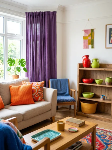
Even experienced crafters fall into a few color traps. Here’s what to watch out for:
- Too many accent colors: Using five or six competing accent colors makes a space feel cluttered, not colorful. Stick to two or three at most.
- Ignoring undertones: A white that looks warm in the store can look pink or yellow on your walls. Always check undertones before committing.
- Forgetting texture: Two items in the same color can look very different if one is matte and the other is glossy. Factor in texture when choosing your palette.
- Matching too perfectly: A room where everything is the exact same shade feels flat. Aim for harmony, not uniformity — slight variation adds depth and visual interest.
Conclusion: Bring Your Space Together With Intentional Color Choices
Understanding how to choose a color palette for your handmade home decor is truly a game-changer. It transforms individual craft projects into a cohesive design story, makes your space feel intentional, and gives every handmade piece the setting it deserves. From using the 60-30-10 rule to understanding mood-based color psychology, each strategy in this guide gives you real, actionable tools to work with.
The most important takeaway? Start with how you want the space to feel, build your palette around that emotion, and use color theory as your guide — not your rulebook. Trust your instincts, test before committing, and remember that the best color palette is the one that makes you happy every time you walk into the room.
Color is one of the most powerful tools in any crafter’s toolkit. Use it with intention, and your handmade home decor will always look thoughtfully designed, not just homemade. Ready to start your next project?
Try applying the 60-30-10 rule to your next craft and see how much of a difference intentional color makes. Share your results in the comments below — we’d love to see how you’re transforming your space one handmade piece at a time!
Frequently Asked Questions
Q: How do I choose a color palette for my handmade home decor if I’m a complete beginner? A: Start by identifying two or three colors you already love and that exist in your room — in furniture, rugs, or artwork. Use those as your foundation and build from there using the 60-30-10 rule.
Keeping it simple is always better than trying to juggle too many colors at once. Q: How to choose a color palette for your handmade home decor when working with multiple rooms? A: Choose a consistent neutral base that flows through all rooms, then use different accent colors per room to give each space its own personality while maintaining overall cohesion.
This creates a sense of flow throughout your home without everything looking identical. Q: Should I match my handmade decor to my wall color exactly? A: Not exactly — that can make the pieces disappear into the background.
Instead, choose colors that complement or contrast your walls in a harmonious way. A warm beige wall pairs beautifully with terracotta and sage accents, for example, without everything blending together. Q: What are the best color palettes for a cozy, farmhouse-style handmade home decor look?
A: Farmhouse style works best with warm neutrals like cream, linen, and soft white, paired with muted accents like dusty blue, sage green, or weathered wood tones. Avoid overly saturated or bright colors — the key to farmhouse charm is warmth and softness. Q: Can I use bold colors in handmade home decor without overwhelming a small space?
A: Absolutely. The trick is to use bold colors sparingly — as that 10% accent in the 60-30-10 rule. A single statement piece in a rich color, like a deep teal macramé or a mustard yellow woven basket, can add personality without making a small room feel cramped or overpowering.