7 Wreath Making Mistakes That Make Your Wreath Look Cheap
Have you ever spent hours crafting a wreath only to have it look like a dollar store reject? You’re not alone. Many DIY enthusiasts unknowingly make simple errors that instantly cheapen their wreath’s appearance.
The good news is these mistakes are completely avoidable once you know what to watch for. Understanding these common pitfalls will transform your wreath-making skills dramatically. In this guide, we’ll explore 7 wreath making mistakes that make your wreath look cheap and exactly how to fix them.
Let’s dive in…
1. Sparse Greenery Coverage

- Extra faux greenery stems
- Floral wire
- Wire cutters
- Hot glue gun
Nothing screams cheap faster than seeing your wreath form peeking through sparse decorations. Beginners often underestimate how much greenery they actually need. This leaves embarrassing gaps that destroy the professional look.
The solution involves layering multiple greenery types at different angles. Start with larger base pieces first, then fill gaps with smaller accent stems. Your wreath should look full from every viewing angle.
Professional wreath makers typically use three times more material than beginners expect. When you think you’ve added enough, add a bit more for that luxurious, abundant appearance.
2. Inconsistent Color Palette

- Color wheel reference
- 3-4 coordinating ribbon spools
- Matching floral picks
- Neutral filler materials
Random color combinations instantly make wreaths look disorganized and amateurish. Your color palette selection determines whether your wreath appears intentional or thrown together. Stick to three main colors maximum.
Choose one dominant color, one secondary shade, and one accent tone. This creates visual harmony that professional designers use constantly. Metallics count as neutral accents.
If you enjoy exploring fun crafts to make at home, mastering color theory will elevate all your creative projects significantly.
3. Poor Quality Ribbon Choices

- Wired ribbon (2.5″ width)
- Fabric ribbon alternatives
- Ribbon scissors
- Lighter for edge sealing
Thin, unwired ribbon is the fastest way to cheapen your wreath’s appearance. Flimsy ribbon refuses to hold shape and wilts pathetically within days. Invest in quality wired ribbon instead.
Professional wreaths feature wired ribbon at minimum 2.5 inches wide. This width creates substantial, eye-catching bows that maintain their structure. Narrower ribbons look skimpy and underwhelming.
Layer two or three coordinating ribbon patterns for designer-level bows. Mixing solid and patterned ribbons adds depth without overwhelming the design.
4. Flat One-Dimensional Design

- Various sized decorations
- Different texture elements
- Floral picks at varying heights
- Dimensional ornaments
Flat wreaths lacking depth look like sad craft store displays. Dimensional layering separates amateur attempts from professional masterpieces. Your wreath needs visual depth desperately.
Create layers by positioning some elements closer to the form and others extending outward. Use varying stem lengths and decoration sizes strategically. This creates shadows and visual interest.
Think of your wreath in three zones: back layer foundation, middle layer bulk, and front layer focal points. Each zone adds crucial dimension that catches light beautifully.
5. Wrong Size Decorations

- Varied ornament sizes
- Proportionate picks
- Measuring tape
- Scale reference photos
Tiny decorations on large wreaths disappear completely, while oversized pieces overwhelm smaller forms. Proper scale and proportion make or break your design immediately. Size matters tremendously here.
For standard 24-inch wreaths, focal ornaments should measure 4-6 inches. Secondary decorations work best at 2-3 inches, with accent pieces even smaller. This creates natural visual hierarchy.
When working on home craft projects quick results often tempt us to grab whatever’s available. Taking time to match decoration scale prevents cheap-looking outcomes.
6. Visible Attachment Methods

- Green floral wire
- Matching color zip ties
- Clear hot glue sticks
- Floral tape
Nothing destroys a wreath faster than visible glue strings and exposed wires everywhere. Sloppy attachment methods scream amateur loudly. Your construction should remain completely invisible.
Use wire that matches your greenery color exactly. Green wire disappears into foliage, while silver wire catches light annoyingly. Wrap wire behind stems rather than across visible surfaces.
Clean up glue strings immediately after attaching each element. A quick pass with a hair dryer on low heat removes stubborn glue strings without damaging decorations.
7. Neglecting the Wreath Back

- Felt backing circles
- Ribbon for hanging loop
- Protective spray coating
- Sturdy wreath hanger
Professionals finish the back just as carefully as the front. An unfinished wreath back with exposed foam and dangling wires looks rushed and cheap. Details matter everywhere.
Cover exposed form materials with coordinating felt or fabric backing. This protects your door from scratches while hiding construction mess. It also prevents decorations from catching on surfaces.
Create a proper hanging loop from matching ribbon rather than using flimsy wire hooks. This small touch adds professional polish that buyers and visitors notice immediately. If you’re creating wreaths as DIY handmade gifts, the finished back shows recipients you genuinely care about quality.
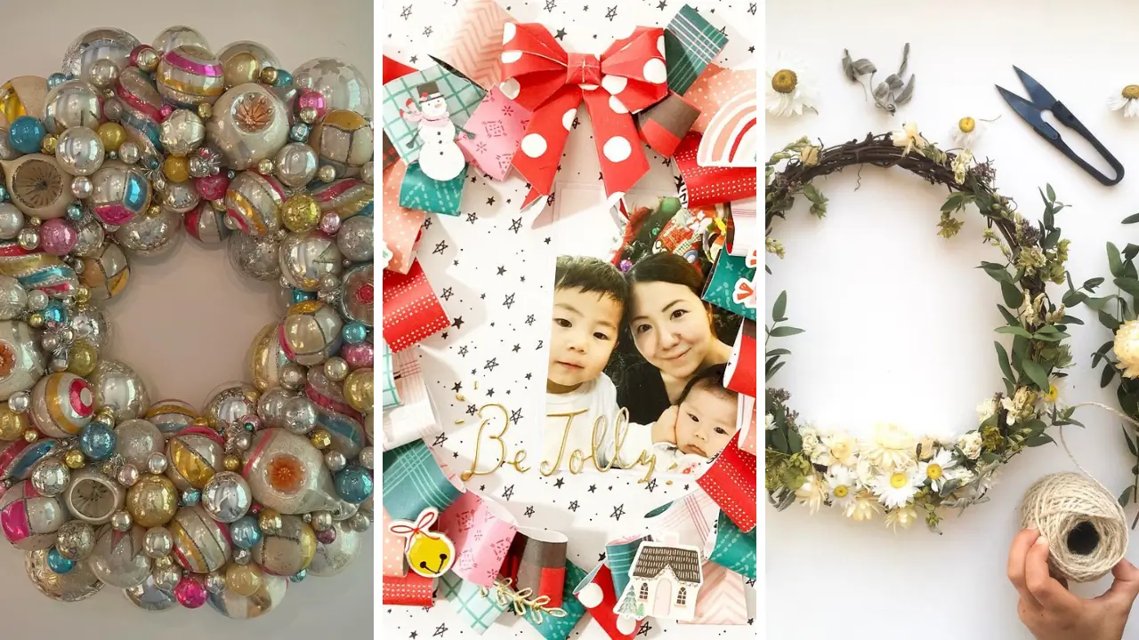
Choosing Quality Base Forms

- Grapevine wreath form
- Wire frame alternative
- Foam form with cover
- Natural twig base
Your wreath form foundation affects everything built upon it. Cheap forms warp, shed, and fall apart embarrassingly fast. Quality bases last through multiple seasons and redesigns.
Grapevine wreaths offer natural texture that enhances rustic designs beautifully. Sturdy wire frames work best for heavy decorations needing secure attachment points throughout. Foam forms suit delicate items but require complete coverage.
Never leave visible foam anywhere since it photographs terribly and looks obviously crafted.
Balancing Visual Weight

- Various weight decorations
- Counterbalance elements
- Design planning sketch
- Level tool
Lopsided wreaths tilt annoyingly and look perpetually crooked regardless of hanging adjustments. Visual weight distribution requires intentional planning from the start. Balance creates professional appeal.
Heavy focal points need counterbalancing elements positioned opposite them. This doesn’t mean identical decorations but rather similar visual weight in complementary positions. Consider exploring DIY wall art ideas for living room spaces where similar balance principles create stunning displays beyond just wreaths.
Securing Outdoor Durability

- UV-resistant spray
- Weatherproof decorations
- Waterproof glue
- Protective door placement
Outdoor wreaths face harsh conditions that quickly reveal cheap materials. Sun fading and moisture damage destroy inferior decorations within weeks. Weatherproofing prevents embarrassing deterioration.
Choose decorations specifically rated for outdoor use. UV-resistant sprays protect colors from fading while waterproof adhesives prevent decorations from detaching during rain. Position outdoor wreaths under covered porches when possible.
This extends lifespan dramatically while maintaining that fresh, just-made appearance longer.
Creating Focal Point Impact

- Statement decoration piece
- Supporting accent elements
- Positioning template
- Step-back viewing space
Wreaths without clear focal points look confused and scattered randomly. Your eye needs somewhere specific to land first. Strategic focal placement guides viewers through your design intentionally.
Position your most impressive element at traditional focal zones like bottom center or asymmetrical thirds. Supporting decorations should frame without competing against your statement piece. Step back frequently during construction to evaluate focal point impact.
Close-up work deceives you about overall visual effectiveness from normal viewing distances.
Matching Seasonal Themes

- Season-appropriate colors
- Thematic decorations
- Natural seasonal elements
- Cohesive ribbon choices
Mixing seasonal elements confusingly makes wreaths look like clearance bin casualties. Cohesive seasonal theming separates intentional design from random decoration dumping. Commit fully to your chosen season.
Spring wreaths feature pastels and florals. Summer embraces bright colors and natural textures. Autumn demands warm oranges, burgundies, and harvest elements.
Winter calls for evergreens, metallics, and rich jewel tones. When you love handmade gift craft ideas, creating seasonal wreaths provides year-round gifting opportunities that recipients treasure.
Avoiding Overcrowded Designs

- Edited decoration selection
- Breathing space plan
- Removal container nearby
- Design restraint mindset
More decorations don’t automatically create better wreaths. Overcrowded designs overwhelm viewers and look desperately chaotic. Strategic empty space actually enhances what you do include.
Edit ruthlessly during construction. If removing a decoration improves the overall design, leave it off permanently. Professional designers know when to stop adding elements.
Allow greenery and base materials to show intentionally between decorations. This breathing space prevents visual exhaustion and lets focal points shine properly.
Now you understand the 7 wreath making mistakes that make your wreath look cheap and exactly how to avoid them. These professional techniques transform amateur attempts into stunning masterpieces worth displaying proudly. Grab your wreath form, quality materials, and start creating your best wreath yet!
Share your favorite tips and finished wreaths in the comments below!
Rate this post